So, in this post, I'll show you how I made one of the illustrations for the introduction of Disorder. (It's my weird history-comic-thing, and it used to be called Despaired Of but I changed it because Disorder is more appropriate.)
I suppose this post is a vague indication of the work that goes into one drawing - and I've not even covered all the stages of it - haha, whoops!


Refs! I wanted the three boys to be characters I've already drawn. One of them is Horatio Ockerby, and another is William Jones - two of the boys whose parents took schoolmaster William Shaw to court for neglect because the boys' sight was damaged in an ophthalmia outbreak at his school. I've already got drawings of these two, including final illustrations from a talk I gave to CDHAS (my local history society) right at the start of March 2020.
The clothing refs are from a number of sources, including extant garments and engravings and fashion plates and cartoons in various museums and galleries.

More refs - this is from a book in the Illustrator's Reference Manual series, published by Bloomsbury in 1990.

Another good reference - yourself! You can draw cool hands if you've got a camera (I use the built-in one on my laptop), and you can draw great hands with a bit of practice. Alternatively, go traditional and spend ages holding a pose in a mirror, or bribe whoever happens to be stuck in the house with you to hold poses for you. What wonderful lockdown memories you'll make together.
On my screen, you can also see one of the CDHAS talk illustrations, showing the Jones brothers giving evidence. We'll never know exactly what they looked like, but that's ok. These are my interpretations of them - and I'd like to encourage you to make your own interpretations of them, or of any other historical person!

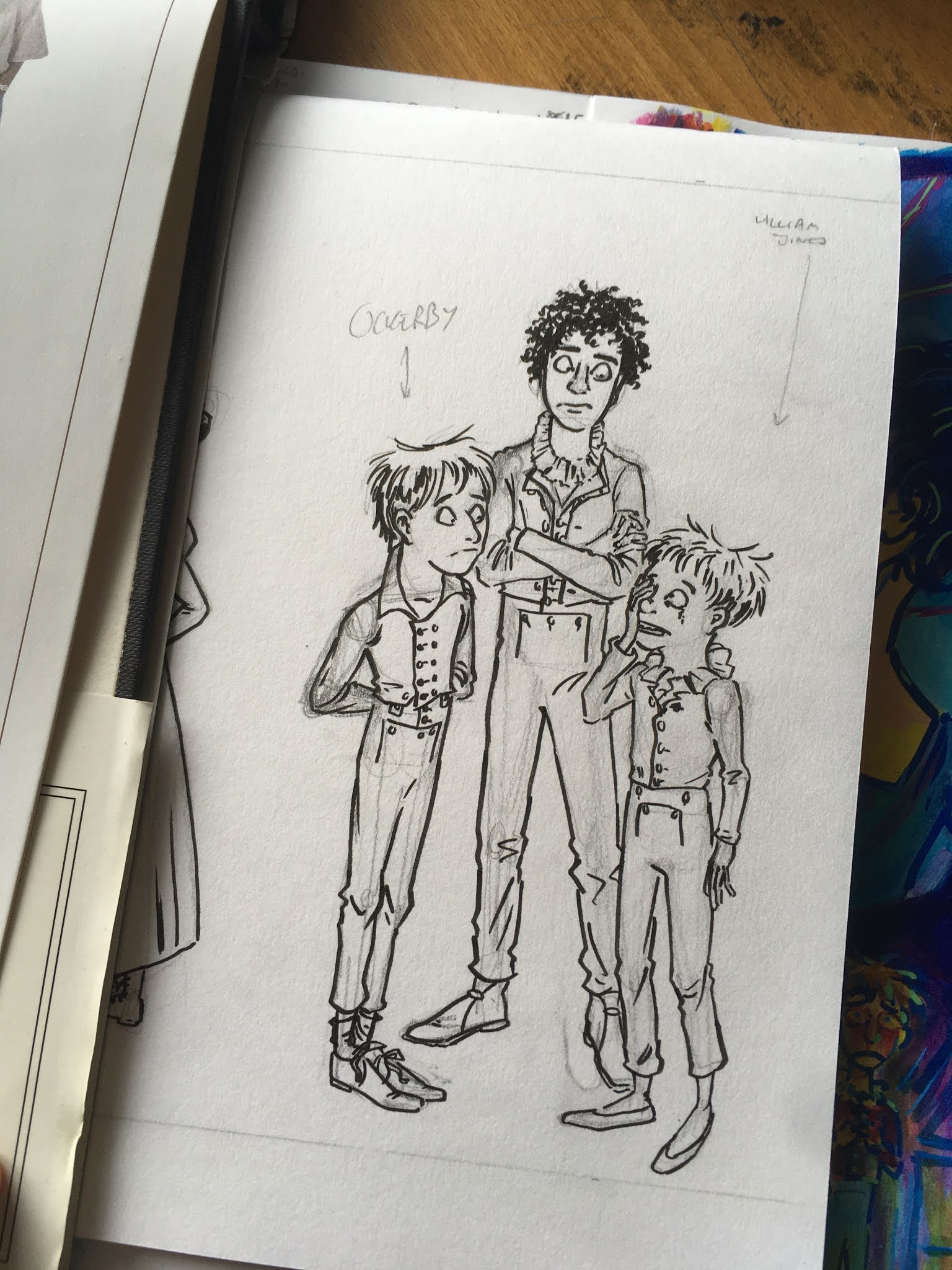
All inked! Now wait for it to dry, and rub out the pencil lines. If you look at the lower part of the image, you can see where I was going to put the tallest boy's left foot, but I decided to move it. In painting, this sort of thing is called a pentimento (no, you can't eat it) which is apparently a trace of an earlier image, or an earlier version of the present image, that's still there, but usually it's been painted over. It's evidence of the creator changing their mind during the process of making the image.

Time to add colour! I think some of the population have ideas that sketchbooks are beautiful places where illustrators and other visual practitioners put all manner of eloquent delights, but they're actually working documents. (Some sketchbooks are deliberately designed to be stunners, though! But not mine.)
I have a certain level of distrust for my media, and I've got to try it out and see what it actually comes out like before I commit to applying it to a drawing; there's less risk of wrecking the thing.
Also, keep notes on your colour choices - the amount of times I've drawn somebody once, and then had to draw them again later, and then I can't remember exactly which shade I've used for their coat or whatever - it saves time and headaches.

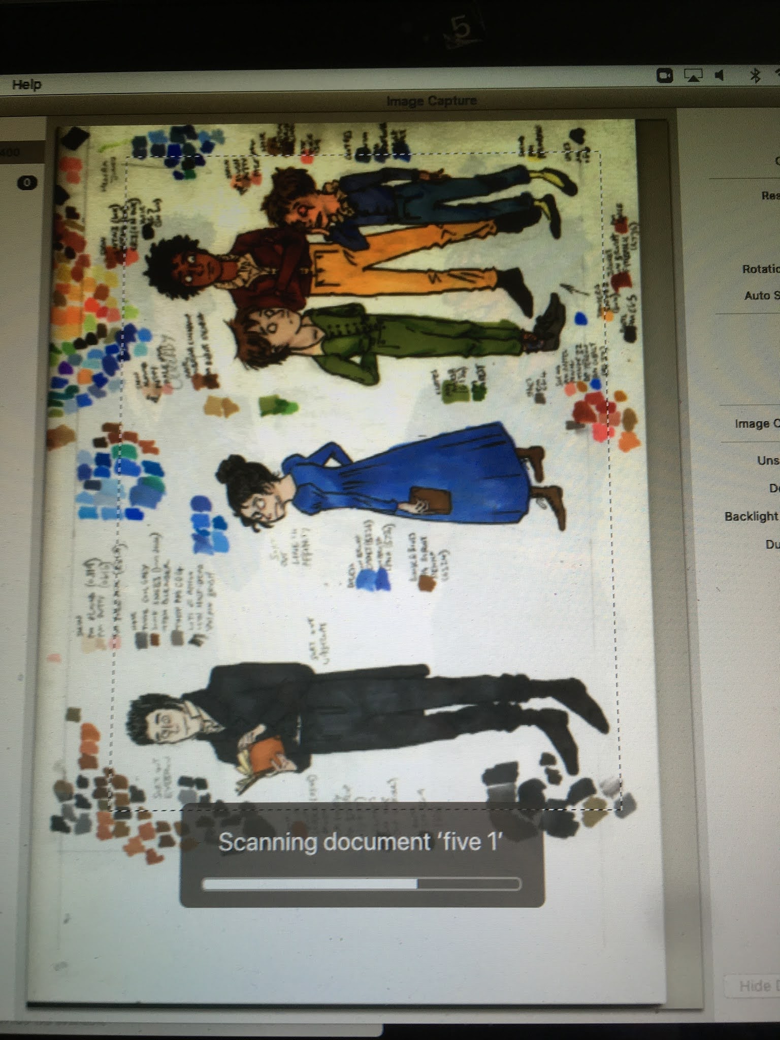
Time to scan! We've got William and Mary Ann Shaw on this page, too. |

I do all my image editing for finals in Affinity Photo. Here I'm messing about with the levels to make the colours a bit snazzier. I'll need to tidy up the edges - much selecting, judicious use of the eraser, that sort of thing. I want this illustration to be a PNG file (it'll have a transparent background) which will allow me to arrange it to look cool in Pages.

Good tip - if you've cut your illustration out, and you want it to have a transparent background, it's useful to make a new layer behind your drawing, and fill it with some dark colour. The artefacts and other random pale bits round the edges will all appear as if by magic, and can be dealt with accordingly.
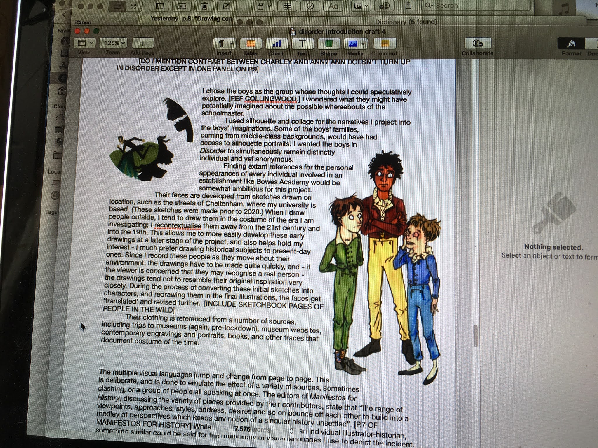
And here's how they'll look in the introduction! I'm on the fourth draft and the thing's nowhere near finished. The words are a work-in-progress. I like to shout in capitals when I need to remind myself to do something.
So that's that! For now. I really need to crack on with that introduction. It's going to be a tasty combination of drawings and words - a proper interdisciplinary piece - which will act as a warm-up to the main event: the comic itself.
No comments:
Post a Comment